
Friday, 31 December 2021
Saturday, 25 December 2021
Abstract Christmas trees light up London’s King’s Cross area
 |
| Temenos |
Temenos, in picture above, is an abstract Christmas tree installation designed by London-based American artist Liliane Lijn. It takes pride of place in London’s King’s Cross area, a hub for national and international travel connections as well as shopping and eatery destinations, and situated amidst some of London's most desirable housing developments. The whole area has been greatly regenerated and landscaped in recent years, and people can enjoy walks along the canal that snakes through the area.

Liliane Lijn's Temenos is set up in Granary Square outside the Central Saint Martins university. Comprising of 19 multi-coloured neon light poles that change colours intermittently, Temenos is 11.3 metres tall.

There are fitted lights along the edges of the "tree", arranged in a conical shape.

There is an opening/entry way which allows visitors to enter the Temenos installation and experience being immersed in neon light.
Meanwhile, nearby at the adjoining shopping and dining destination Coal Drops Yard, is an abstract Christmas tree called Prism, designed by Heatherwick Studio, and installed by lighting specialists This is Loop.
 |
| Prism |
This 8.5 metre-high Christmas tree light installation is covered in mirrors and embedded with strips of multi-coloured lights to coincide with the festive atmosphere.

A tunnel runs through the centre of the installation to allow visitors to pass through and experience a kaleidoscopic space filled with light reflections and colour.
All photos by Lucia Carpio for MyFashionConnectGlobal.
Wednesday, 15 December 2021
Furniture and wall paint guru ANNIE SLOAN proposes NEW NEUTRALS
While Pantone’s new Very Peri colour of 2022 is inspiring many design ideas, some colour houses are going for calming neutral ranges for the new year.
Take Annie Sloan for example. The paint guru is breathing fresh life into tired bedrooms with Wall Paint and Chalk Paint™.
 |
| Annie Sloan Bedroom featuring Pompadour Wall Paint; Floor in Chalk Paint™ Old White; Bed in Amsterdam Green; Bedside table in Pure with Olive, and Pure mix details. Lamp in Honfleur, Old Ocgre and Original. |
A highlight of the 32-shade Wall Paint palette, Pompadour is a warm white inspired by French courtier Madame de Pompadour.
The delicately pigmented shade reflects the warm complexities and subtle shade-shifting properties of fine porcelain.
“From painted walls to painted floorboards, an all-neutral scheme will give your room the illusion of being bigger and brighter, while creating a soothing space for sweet dreams and lazy Sunday mornings,” says Annie.
“To avoid a clinical look, introduce a disrupter colour on a focal piece such as a bedframe. A burst of your favourite statement shade will add personality and really pop against the clean gallery-style backdrop.” Transform a high street bedframe with just a lick of paint, for an easy, affordable update with maximum impact.
Without the need to prime or sand, painting furniture with Chalk Paint™ is all in a day’s work - just remember to finish with at least two coats of Chalk Paint™ Wax or Lacquer to seal and protect your handiwork, advises Annie Sloan. For an extra dose of charm, update smaller furniture and accessories with hand-painted details.
Annie Sloan invented her revolutionary furniture paint, Chalk Paint®, in 1990 and hasn’t stopped refining and improving her formula since. She is widely considered one of the world’s leading authorities in paint, colour and style.
Tuesday, 14 December 2021
Pantone® 17-3938 Very Peri fires up imagination in Home Décor and Interior Design
Ever since Pantone announced its new colour of the year 2022, the PANTONE 17-3938 Very Peri, it has animated designer's imagination. The colour's modernity and creativity spirit inject a sense of playful freshness into home interiors, enlivening a space through unusual colour combinations. It is also a versatile shade and is suited to an array of different materials, textures and finishes, providing a pop of colour, whether introduced through a painted wall, accent furniture or home décor, or acting as an intriguing and eye-catching accent in a pattern.
At Wallsauce.com, creators of premium wallpaper murals, it has released it’s a series of five designs that complement Very Peri. A couple of them are shown here.
 |
| The Deep Wall Mural by Lara Skinner at Wallsauce.com |
Focussing on Pantone’s description of ‘dynamic periwinkle blue hue with a vivifying violet red undertone', the wallpaper designs reflect the energy and confidence of this brand new colour; which for the first time since 1999, they have created an entirely new colour:
From a powerful geode design to carefree watercolour blends, all five wallpapers express tones that complement this brand new Pantone colour.
 |
| Dreamy Pastel And Gold watercolour wallpaper mural available at Wallsauce.com |
Rachel Kenny, head of the design studio at Wallsauce.com says: “Blues have been trending beyond this year since the navy trend decorated our homes. It’s a delight to see a more uplifting tone that’s going to bring us happy and warm vibes.
With its periwinkle blue hue, Very Peri almost reminds us of cornflower blue littering summer strolls in fields with lots of fresh air – something we’ve all been missing recently!
We wanted to reflect that uplifting feeling with statement pieces that complement Very Peri. Choosing wallpaper designs that merge in true blues, purples, pinks and greens, we hope to have created a positive collection that’s also not for the faint-hearted.”
Wallsauce.com is one of the leading producers of custom made wallpaper murals. To discover more powerful purple wallpapers that are ready to bring energy to homes, head to Wallsauce.com.
Meanwhile, at British online art print destination Claude & Leighton® comes a carefully curated selection of wall art prints, which also complement the new Very Peri.
 |
| A Very Peri gallery wall with art prints by Claude & Leighton |
The art prints, created by artist, designer and co-founder of Claude & Leighton, Jayne Leighton Herd, feature the periwinkle violet blue shade that interior designers, stylists and homeowners alike will be crushing on during the year ahead.
 | ||
| Scottish Landscape Art Print - Alba III - by Claude & Leighton, | from an original painting by British artist Jayne Leighton Herd. |
The collection includes prints of abstract and landscape paintings, as well as brand new geometric design artwork, ampersand typography posters and abstract face line drawings. All very much in keeping with Pantone’s Very Peri colour ethos of joyous attitude and imaginative expression.
 |
| Very Peri Blue Abstract Face Line Drawing Art Print by Claude & Leighton |
The trending colour is positive, uplifting and easily relatable, inspiring thoughts of flowers, spring fresh air and meadows, says Claude & Leighton.
And it’s a colour which can be added to homes and offices simply, through the use of art and accent accessories, without the burden of redecorating.
The prints work well as standalone pieces, or can be included as part of a gallery wall display.
Available unframed in various sizes, each print in the collection is produced with high quality, fade-resistant inks on premium heavyweight, acid-free archival paper, to ensure it will last a lifetime.
PANTONE® introduces Very Peri Colour Of The Year 2022 - exuding a courageous presence to entice personal inventiveness and creativity
In announcing the chosen colour for the year 2022, Pantone the global colour authority recognizes colour continues to be a critical form of communication in our society, and a way to express and affect ideas and emotions and engage and connect. The complexity of PANTONE® 's new colour - a new dynamic periwinkle blue hue with a vivifying violet red undertone - highlights the expansive possibilities that lie before us.
 |
| Blending the faithfulness and constancy of blue with the energy and excitement of red, this happiest and warmest of all the blue hues introduces an empowering mix of newness, displaying a carefree confidence and a daring curiosity that animates our creative spirit. Rekindling gratitude for some of the qualities that blue represents complemented by a new perspective that resonates today, PANTONE 17-3938 Very Peri places the future ahead in a new light. |
Reportedly this is a completely new tone created for the PANTONE FASHION, HOME + INTERIORS colour palette, considered an apt hue that captures the world we are living in now in transformative times, As we emerge from an intense period of isolation, our notions and standards are changing, and our physical and digital lives have merged in new ways. Digital design helps us to stretch the limits of reality, opening the door to a dynamic virtual world where we can explore and create new colour possibilities.
According to Pantone's top executives, this unique Very Peri colour symbolises the global zeitgeist of the moment and the transition we are going through. With trends in gaming, the expanding popularity of the metaverse and rising artistic community in the digital space PANTONE® 17-3938 Very Peri illustrates the fusion of modern life and how colour trends in the digital world are being manifested in the physical world and vice versa.
“As we move into a world of unprecedented change, the selection of PANTONE 17-3938 Very Peri brings a novel perspective and vision of the trusted and beloved blue colour family,” says Leatrice Eiseman, Executive Director, Pantone Color Institute.
“Encompassing the qualities of the blues, yet at the same time possessing a violet-red undertone, PANTONE 17-3938 Very Peri displays a spritely, joyous attitude and dynamic presence that encourages courageous creativity and imaginative expression.”
“The Pantone Color of the Year reflects what is taking place in our global culture, expressing what people are looking for that colour can hope to answer,” added Laurie Pressman, Vice President of the Pantone Color Institute.
“Creating a new colour for the first time in the history of our Pantone Color of the Year educational colour program reflects the global innovation and transformation taking place.
Wednesday, 8 December 2021
New Apparel and Footwear Line Features Characters and Graphics from Monopoly, Twister, Scrabble and Candy Land
Just in time for some playful competition during the holiday season, Champion Athleticwear, makers of authentic athletic apparel since 1919, is announcing the launch of a limited-edition collection with Hasbro Gaming, with characters and graphics from some of world’s most beloved games: Monopoly, Twister, Scrabble and Candy Land.
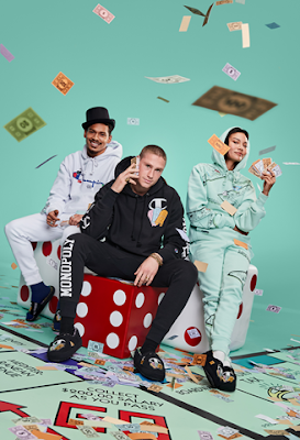
From Mr. Monopoly spreading his wealth across the Reverse Weave canvas to Twister reimagined on tees, the collection lets fans showcase their favourite games.
“Spirited play, competition and board games go together during the holiday season, and this collection lets fans look good doing it,” said Jon Ram, Group President of Global Activewear at Hanesbrands Inc.
“Hasbro and Champion deliver products that consumers love and are enjoyed by generations of fans. Champion is about letting people express themselves. And the collection is one more way consumers can ‘Be Your Own Champion,’ both on the board and off.”
The collection features global board game favorites for a head-to-toe look on classic Champion apparel, and footwear such as slides, and slippers.
Designs feature iconography from the Monopoly board, Monopoly money, Mr. Monopoly, the Twister spinner, coloured dots from the Twister mat, Scrabble tiles spelling out “Champion” and “Be Your Own Champion” and magical Candy Land-inspired graphics, including Mally Mallo, Twirly Girl, Cutie Cone and Giggly Gumdrop. Footwear will be sold in custom shoe boxes with graphics to align with each game’s branding.


“Just like Champion, Hasbro Gaming offers a memorable experience for everyone in the family,” said Casey Collins, Head of Global Licensed Consumer Products and Business Development at Hasbro.
“So, this collaboration was an easy yes for us. We want to continue to encourage families and friends to use our games as the perfect way to make memories this holiday season as well as incorporate their favorite games into their everyday life. Now, they can do so in this extremely comfortable (and fun!) collection.”
To ensure everyone in the family is happy this holiday season, Champion has designed the collection for fans of all ages, including adults, youth, and toddlers.

Champion styles across each Hasbro game include Reverse Weave pullover hoodies and crews, joggers, short sleeve tees, cropped hoodies, boyfriend sweatpants, kid’s fleece hoodies, joggers and tees, and more.
The collection is available now on Champion.com, in select Champion retail stores and at select retailers. Adult sizes range from XS-2XL
All images from HanesBrands Inc.
Monday, 6 December 2021
Quirky images add fun to home interiors
Once in a while, an image catches your eye and stops you in your track.
Such as this quirky image from Young & Battaglia that showcases a wonderful blend of colours, textures and imagery. This is a classic Mineheart cushion design that blends classic styles of art with a quirky twist.
 |
| "English Lady In A Jungle Blue" cushion shown above is among a new range of cushion covers from Young & Battaglia, designed to impress while adding a dash of uniqueness to interior design. Now available at Mineheart. |
Young & Battaglia design studio was founded by Anglo-Italian design duo Brendan Young and Vanessa Battaglia both trained in Industrial design.
Their body of work has included a wide variety of creative disciplines from interior design to landscapes, product design, graphics and art direction. They are the founding partners of British interiors brand Mineheart, an online outlet for their own creative works while they also collaborate with designers from around the globe, and produce an iconic collection of art, wallpaper and accessories for extraordinary interiors. The range includes prints, wallcoverings, lighting furniture and rugs by artists including Himitsuhana, Angela Rossi, Studio Bleoh, Emanuele Pangrazi, Courtney Brims and Stefano Bonazzi.
 |
| Bubblegum Portait – 3 by Young & Battaglia in collaboration with artist Kirin Young. The ‘Bubblegum’ series Portrait Wall artwork is printed on stretched art canvas and mounted in a painted classic wooden black box frame. |
Images from Young & Battaglia/Mineheart.
The story behind the artist of Blossom Première Vision campaign
Paris Blossom Première Vision fair opens today, after a two-year absence.
The Blossom Première Vision show dedicated to the pre-collections of the textile industry’s creative weavers, tanners and accessory manufacturers returns this winter in Paris on 6th and 7th December with 121 exhibitors, who are presenting their Spring/Summer 2023 ranges at the Carreau du Temple in Paris.
 |
| London artist Anna Bu Kliewer’s work for this season’s Blossom Première Vision campaign is both playful and sweet. Through her digitally and analogically crafted collages, she questions our perceptions of identity and nature in an expressive world filled with charm and humour. Image from Blossom Première Vision. |
Marking the return of Blossom Première Vision is a unique campaign image to convey a message of “optimism and renewal,” according to organisers, created by London-based artist Anna Bu Kliewer, who specializes in surrealist photo collages.
Anna who defines herself as “Gerkainian”, was born in Ukraine and raised in Germany, and is known for her photo collages combining human figures and elements of nature.
Anna said she enjoys creating colourful and vibrant artworks, particularly incorporating flowers. “When I was creating this particular artwork I actually bought some pink flowers that morning,” said the artist, who finds colours in daily life as well as books inspirational.
While photography is important to her work, there is often no hidden messages in the images she creates.
“There is not a message I want to send through, but rather have the viewer interpret it in their own way depending on their dreams and phantasies. But I do like my work to have a humorous connotation.” In an interview on the Blossom PV website, Anna said her creativity is driven by her curiosity about space, time and alternative realities.

Subscribe to:
Posts (Atom)